

Project Overview
Duration
January 2023 - February 2023
1 Month, Approx 90 hours
Tools

Figma

Illustrator

Zoom

G-Suite
background
The RoseWater app aims to create a user-friendly app that allows users to conveniently borrow, buy, or exchange books with others in their local area, addressing the issue of costly book rentals. By eliminating intermediaries and leveraging location based services, the app promotes affordability, fosters community-driven book-sharing networks, and encourages knowledge exchange.
problem
Renting books can be costly, especially if local libraries don’t carry the books you are looking for. Some book renting websites can be costly, making it difficult for some to borrow textbooks and books not available at their local library.
THE GOAL
To create a user-friendly app that provides a convenient and accessible platform for users to either borrow, buy or exchange books with people in their local area. Conduct research to confirm or challenge assumptions about user behavior.
01. Research
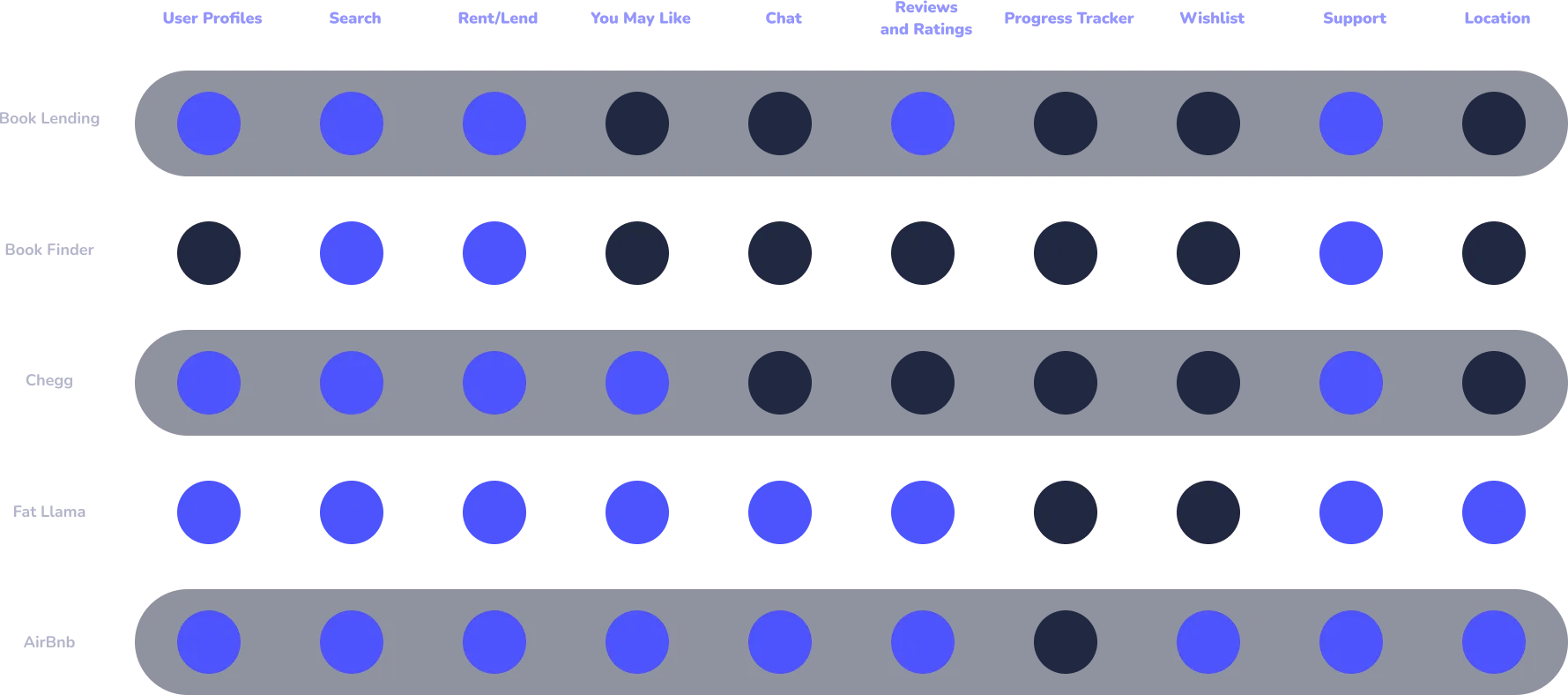
Competitive Analysis
I began research by conducting a competitive analysis by looking at apps and websites that offered similar services. Through my research, I discovered 3 direct competitors (Book Lending, Book Finder, and Chegg) with 2 indirect competitors (Fat Llama and AirBnb). Wait a minute, AirBnB? Isn't that a home rental service? Here me out, AirBnB allows users to HOST (lend a book) and RENT (borrow a book) which makes AirBnB the perfect indirect competitor on identifying rental and borrowing patterns. These insights show what users expect from a streamlined rental service.
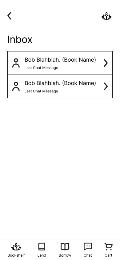
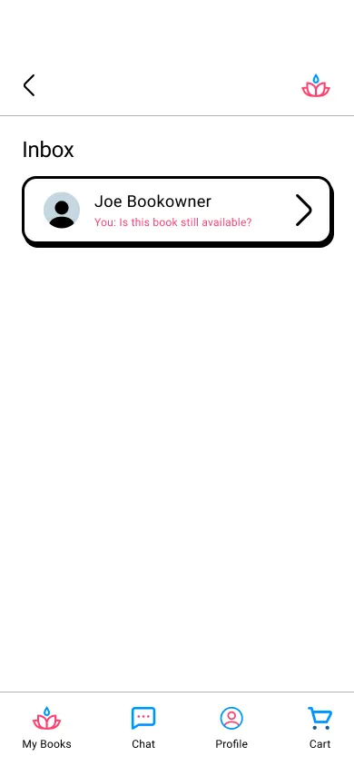
My research lead me to the conclusion that offering users some type of profile that allows them to show the books they were loaning out or renting was an important feature to have. Features like intuitive search functionality allow users to put specific book and textbook information to look up what they are specifically searching for. Since the RoseWater book lending platform is a more personal renting experience, having open communication, via a chat function, to and from the lender, fills a gap in the book rental market that our direct competitors don't currently offer.
02. Empathize/Define
Problem Statements
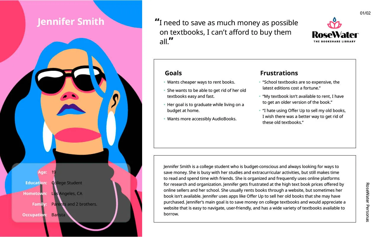
Jennifer Smith is a busy student who needs a cheaper way to rent college textbooks because she can’t always get her book for cheap or find it for rent.
Tony Anderson is a/an hardworking construction worker who needs an easy way to lend out his books because he wants to take advantage of his book collection to make extra money on the side.
Persona Development
From my research, I identified 2 groups of users who would benefit from the app. Jennifer Smith represents our group of users who are students and are looking for a more affordable way of borrowing books. The following user story was developed for Jennifer: As a busy student, I want to be able to easily search and borrow books from other users, so that I can find the books I need without having to visit the bookstore or library.
Tony Anderson represents our working class demographic that is interested in loaning out books to make money on the side. The following user story was developed for Tony: As a construction worker who wants to make extra money, I want to be able to easily lend and rent my books to others, so that I can share my books with others and make some extra money while doing so.
03. Ideate

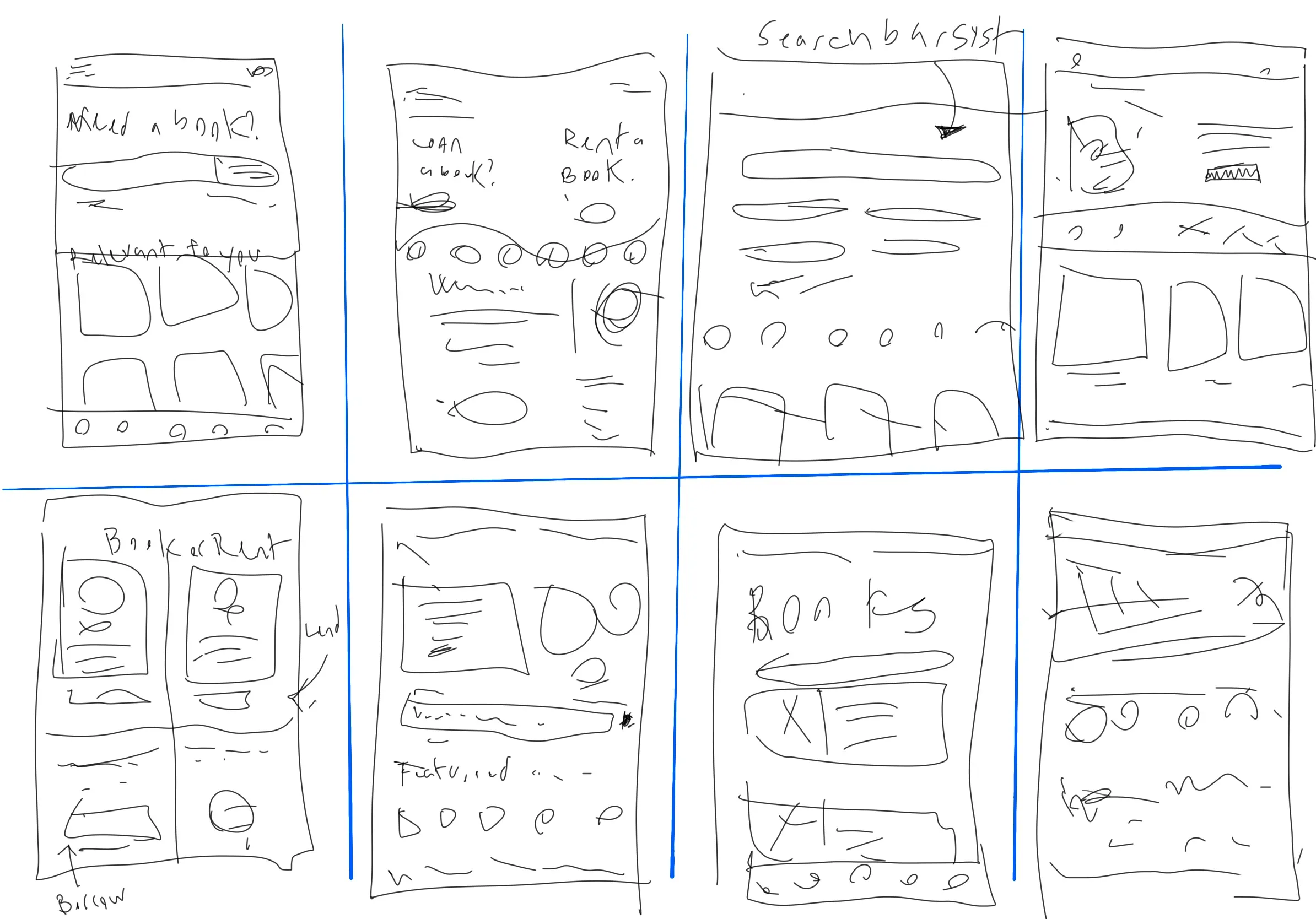
Crazy 8 Sketches
I used the "Crazy Eights" technique to sketch various homepage versions and to decide on effective information to include. This involved creating 8 sketches in 8 minutes, exploring different approaches to organizing information. Taking our users into consideration, I wanted there to be a clear way for users to upload books and search for new books accessible on a majority of the screens.
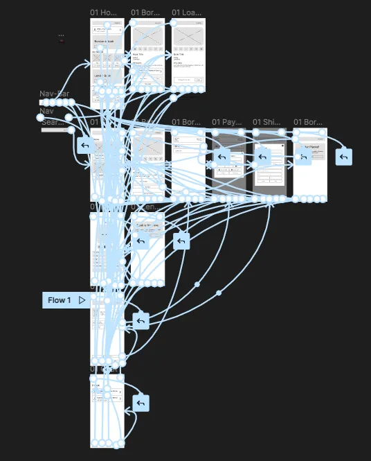
Information Architecture
To begin the ideation process, I wanted to get a feel of what the potential user flow could be. This lead me to generate a site map to visually layout the information architecture. Since this project focus on the primary and secondary user flow, I wanted to be thorough on the user flow for borrowers and lenders. This lead for the need of having a user profile and chat section laid out on the site map to fill the gap in the market that I previously identified.
Digital Wireframes
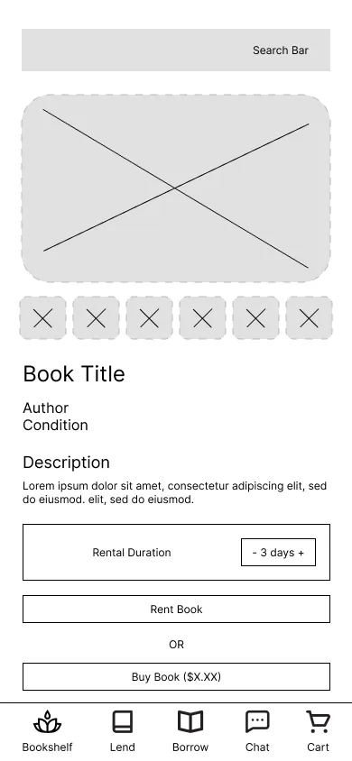
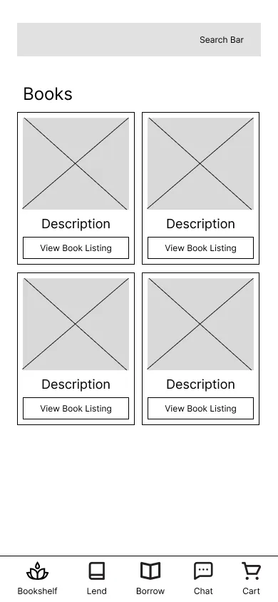
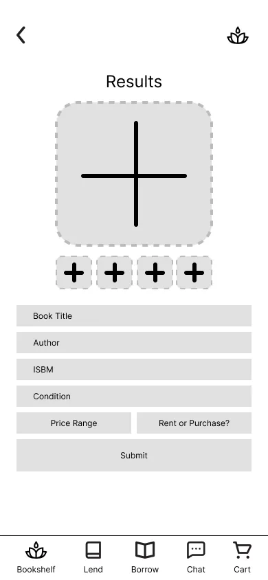
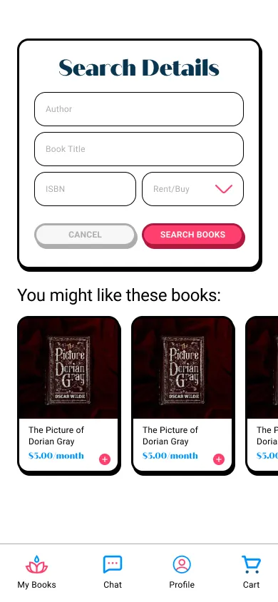
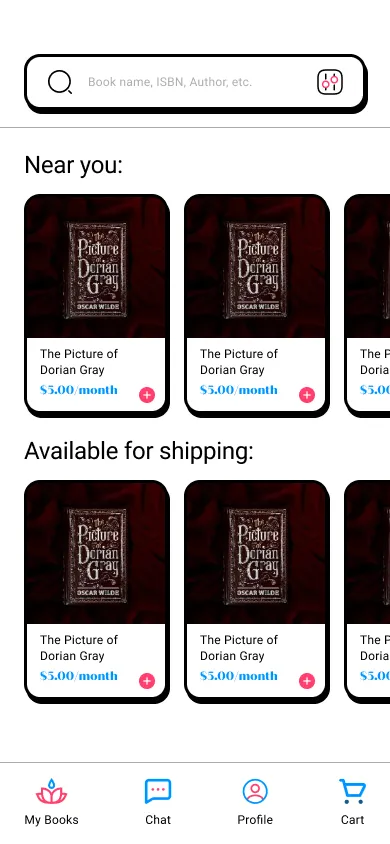
After the initial sketching, I created digital wireframes with a primary focus on ensuring easy access to main user flows. I wanted each screen to have a search bar, taking into consideration of Jennifer's needs of being able to easily find the book she needs.
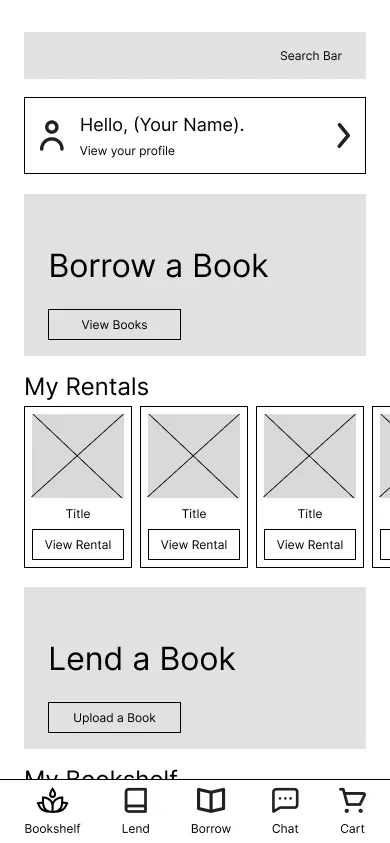
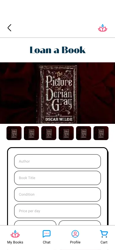
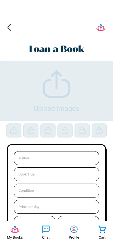
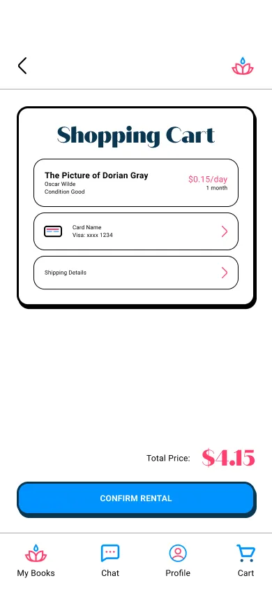
To make sure I addressed the needs of Tony, I made a user profile "bookshelf" section, which allows users to check their loans and what rentals they currently have. This ensures that the primary needs our users may have are met.
04. usability study
Parameters
Study Type: Moderated usability study.
Location: 3 participants, Remote, USA.
Duration: 20-30 minutes
Research questions
How long does it take users to rent a book?
Are users able to successfully upload a book?
What can we learn about the steps a user took when renting a book?
Could the user successfully navigate to other sections of the app?
Are there any parts of the renting/lending process that users get stuck?
Can the user successfully navigate the payment process?
Research Goals
In this usability study I had participants share their screens over Zoom and navigate through the primary user flow by asking them prompts and follow-up questions. I wanted to test the design which allows users to borrow books from people willing to lend out their books. My goal is to see what pain points are in the current design when navigating the flows for uploading books, renting books, and checking the status of their rentals.
affinity map & Insights
After conducting the usability study, I assorted all the feedback I received into an affinity map. I categorized the notes into 3 sections from the patterns I identified: confusion, copy issues, and feature requests. These findings led to the following insights:
Based on the theme that: 60% of users got confused looking at the homepage, an insight is: a majority of users might not know where to start on the homepage.
Based on the theme that: 60% users were confused by labels, an insight is: a majority of users want clear labels in order to continue through the flow.
Based on the theme that: 70% of users were confused by purchase/rent buttons, an insight is: a majority of users felt misled by button copy.
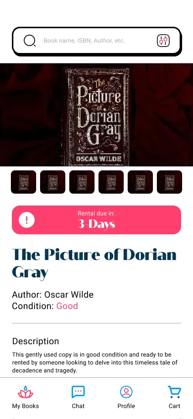
Based on the theme that: 40% of users found it hard to check when rentals were due, an insight is: the rental due dates need to be more prominent and noticeable.
Based on the theme that: 40% of users thought that the nav bar items were redundant, an insight is: some users were expecting different pages on the nav bar.

05. Visual Design
Brand Identity
The premise of the RoseWater app branding is based around Kurt Vonnegut's book "God Bless You, Mr. Rosewater". The colors for the app nod to one of the book covers which use blue colors and pinks to highlight both the 'rose' and the 'water'. The mark itself uses the font 'Quiche Sans' which captures the library nature of the app.

Design System
The design system for RoseWater aims to strike a balance between appealing to a younger audience, like Jennifer, while meeting the expectations of other users, including Tony. Drawing inspiration from neubrutalist branding, the system incorporates high-contrast sans serif fonts, bold colors, and playful solid color drop shadows. These elements ensure legibility, add vibrancy, and enhance the visual hierarchy, creating a visually appealing and engaging experience for a diverse range of users.

Mockups And Screens
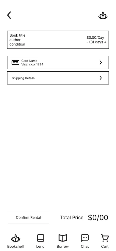
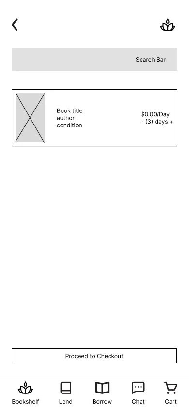
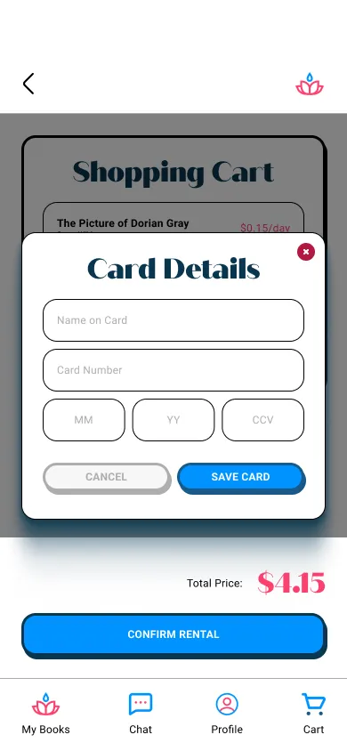
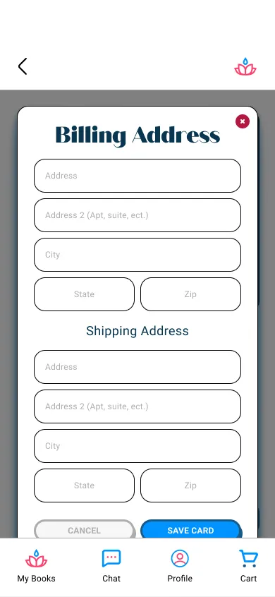
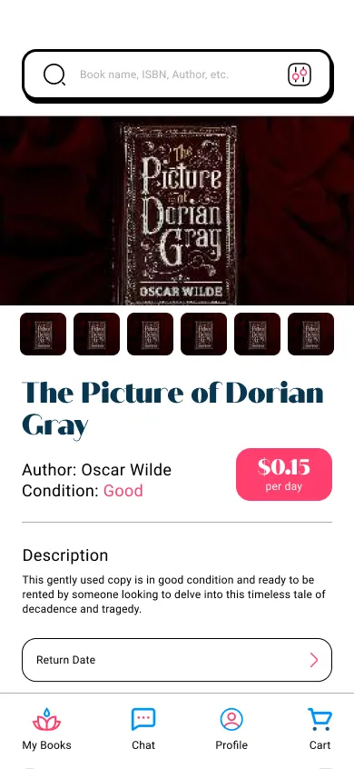
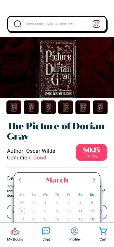
In response to the insights gathered, I made design changes to address user concerns and improve the overall experience. Notably, I focused on enhancing clarity and intuitiveness by implementing clearer labels and buttons on product cards, enabling users to quickly grasp the purpose of each interaction.
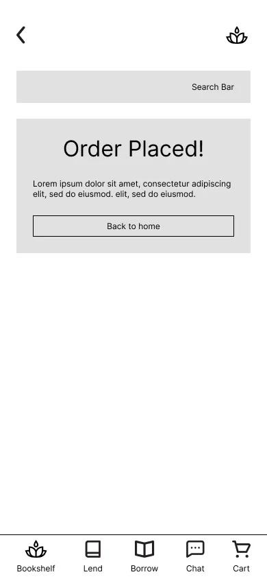
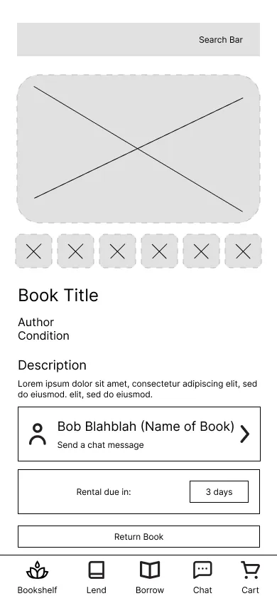
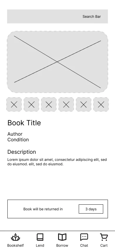
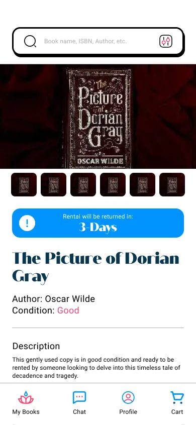
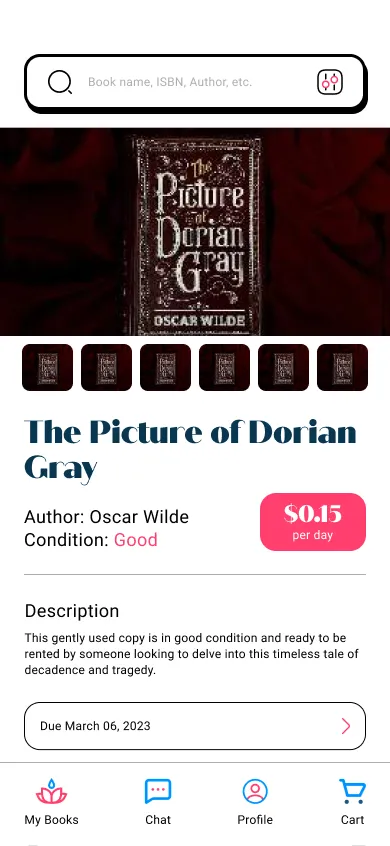
Additionally, to further enhance usability, I incorporated clear notifications above the book description, providing users with easily visible reminders of the due date for returning the book. These design improvements aim to streamline user interactions and ensure a seamless and efficient experience within the app.
06. Hifi Prototype & takeaways
High-Fidelity Prototype
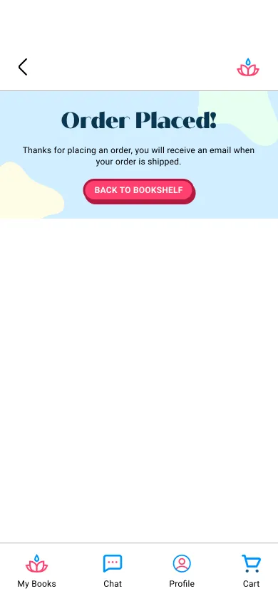
The high-fidelity prototype of the RoseWater app embodies a visually engaging and user-centric experience. It features high-contrast fonts, bold colors, and playful drop shadows. Clear labels, buttons, and notifications ensure intuitive navigation and convenient reminders for users, like Jennifer and Tony. This prototype represents a seamless and enjoyable book-sharing experience.
Accessibility considerations
Due Dates: To keep users informed about due dates and return dates of borrowed books, notifications were implemented.
Hierarchy: Clear hierarchy through the use of large headings and bold contrast guides users through the primary user flow.
High-Contrast: The combination of bright colors and white backgrounds facilitates a seamless user flow by emphasizing key details throughout the interface.
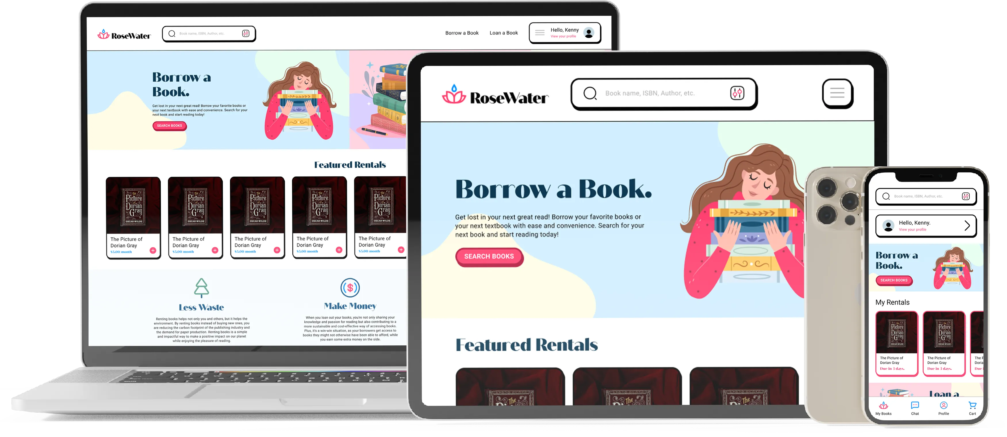
Responsive Design
The design was adapted to different screen sizes, ensuring that the app/website would be accessible and user-friendly on various devices.
Next Steps
By completing the user flows for both desktop and tablet devices, I can gain valuable insights into the final product.
Incorporating a feature that enables users to conveniently drop off books at local "Little Free Libraries," could enhance the book-sharing experience and fostering community participation.
Enabling a book swapping feature could benefit users who are interested in reading but are unable to afford renting books.
Takeaways
From my time working on the RoseWater app, I learned about the importance of avoiding biases during the app creation process and realized that creating an excellent experience for the book loaner is equally important as for the book borrower. The usability studies I conducted provided key insights on creating clear hierarchy on each screen, to help users through the user flow. Overall, creating an affordable, inclusive, and engaging book-sharing experience could help foster a sense of collaboration and generosity among users in their local communities.